Your basket is currently empty!
Or choose one of our latest products
Showing all 16 resultsSorted by latest

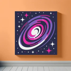
Recycled framed canvas

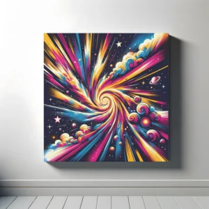
Recycled framed canvas

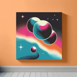
Recycled framed canvas

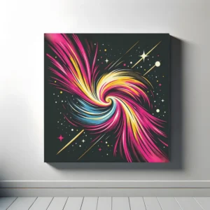
Recycled framed canvas

Recycled framed canvas

Recycled framed canvas

Recycled framed canvas

Recycled framed canvas

Recycled framed canvas

Recycled framed canvas

Recycled framed canvas

Recycled framed canvas

Recycled framed canvas

Recycled framed canvas

Recycled framed canvas

Recycled framed canvas
Explore our Turquoise Space Art collection, featuring stunning space-themed prints with turquoise as the dominant colour. This guide will help you match our art with your room’s colour scheme, using basic colour theory principles.
Complementary colours sit opposite each other on the colour wheel. Turquoise and coral are perfect examples. Adding turquoise art to a coral room (or vice versa) creates a vibrant look that pops. This contrast brings energy and balance to your space.
Analogous colours are next to each other on the colour wheel, like turquoise, blue, and green. Combining these colours in your decor creates a harmonious and soothing atmosphere. Our turquoise art can blend beautifully with blue or green accents in your room, enhancing its calming and refreshing vibe.
A monochromatic colour scheme uses different shades, tints, and tones of a single colour. Decorating with various shades of turquoise can give your space a cohesive and sophisticated feel. Our collection offers a range of turquoise shades to help you achieve this serene and inviting look.
Triadic colour schemes use three colours that are evenly spaced around the colour wheel, such as turquoise, magenta, and gold. This approach adds a lively and colourful energy to your room. Start with a piece from our turquoise art collection and incorporate magenta and gold elements for a dynamic and playful space.
By understanding these colour theory principles, you can choose art that complements your existing decor or inspires a new design. Our Turquoise Space Art collection is here to enhance your home with the beauty and tranquility of the cosmos.