Your basket is currently empty!
Or choose one of our latest products
Showing all 6 resultsSorted by latest

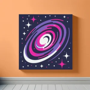
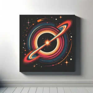
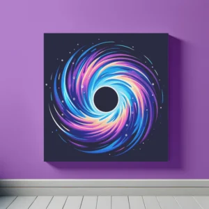
Recycled framed canvas

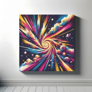
Recycled framed canvas

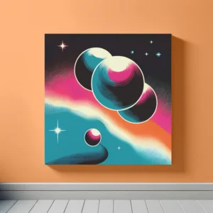
Recycled framed canvas

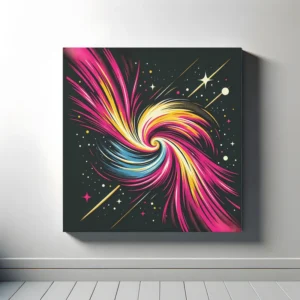
Recycled framed canvas

Recycled framed canvas

Recycled framed canvas
Explore our White Space Art collection, featuring stunning space-themed prints with white as the dominant colour. This guide will help you match our art with your room’s colour scheme, using basic colour theory principles.
White, as a neutral, doesn’t have a complementary colour in the traditional sense, but it pairs beautifully with every colour, providing a crisp, clean contrast. Utilising white art in any coloured room enhances clarity and brings a fresh, airy feel.
While white technically doesn’t fit into analogous colour schemes, it serves as a perfect backdrop or accent for any analogous pairing, adding brightness and highlighting the colours’ harmony. Incorporate white art to balance and lighten rooms with analogous colour schemes.
A monochromatic scheme with white involves using various shades of white, from pure white to off-white and cream, creating a serene and sophisticated space. Our white art collection can add texture and subtle contrast within a monochromatic white design, offering elegance and depth.
White art acts as a unifying element in triadic colour schemes, offering a neutral ground that lets the vibrant colours stand out. Incorporating white space art into a room with a triadic scheme, such as blue, red, and yellow, will bring balance and ensure the colours pop without overwhelming.
By understanding these colour theory principles, you can choose art that complements your existing decor or inspires a new design. Our White Space Art collection is here to enhance your home with the purity and simplicity of the cosmos, adding a touch of serene beauty to any space.